· Frontend Development · 4 min read
5 Powerful React Component Libraries Built on ShadCN/UI
Everyone’s talking about ShadCN/UI these days. If you’re building in React, there’s a good chance you’ve already tried it—or at least heard of it.
But instead of always building everything from scratch, you can use fully-built component libraries that sit on top of ShadCN. These are polished, production-ready kits that help you ship faster while still keeping that clean, modern feel.
So, in this post, I’ll walk you through five really good libraries that are built on top of ShadCN/UI. These are all open source, well-built, and designed to help you go from idea to UI quickly.
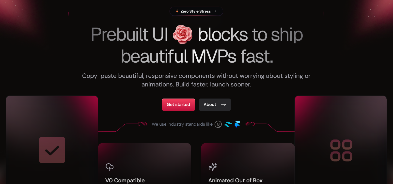
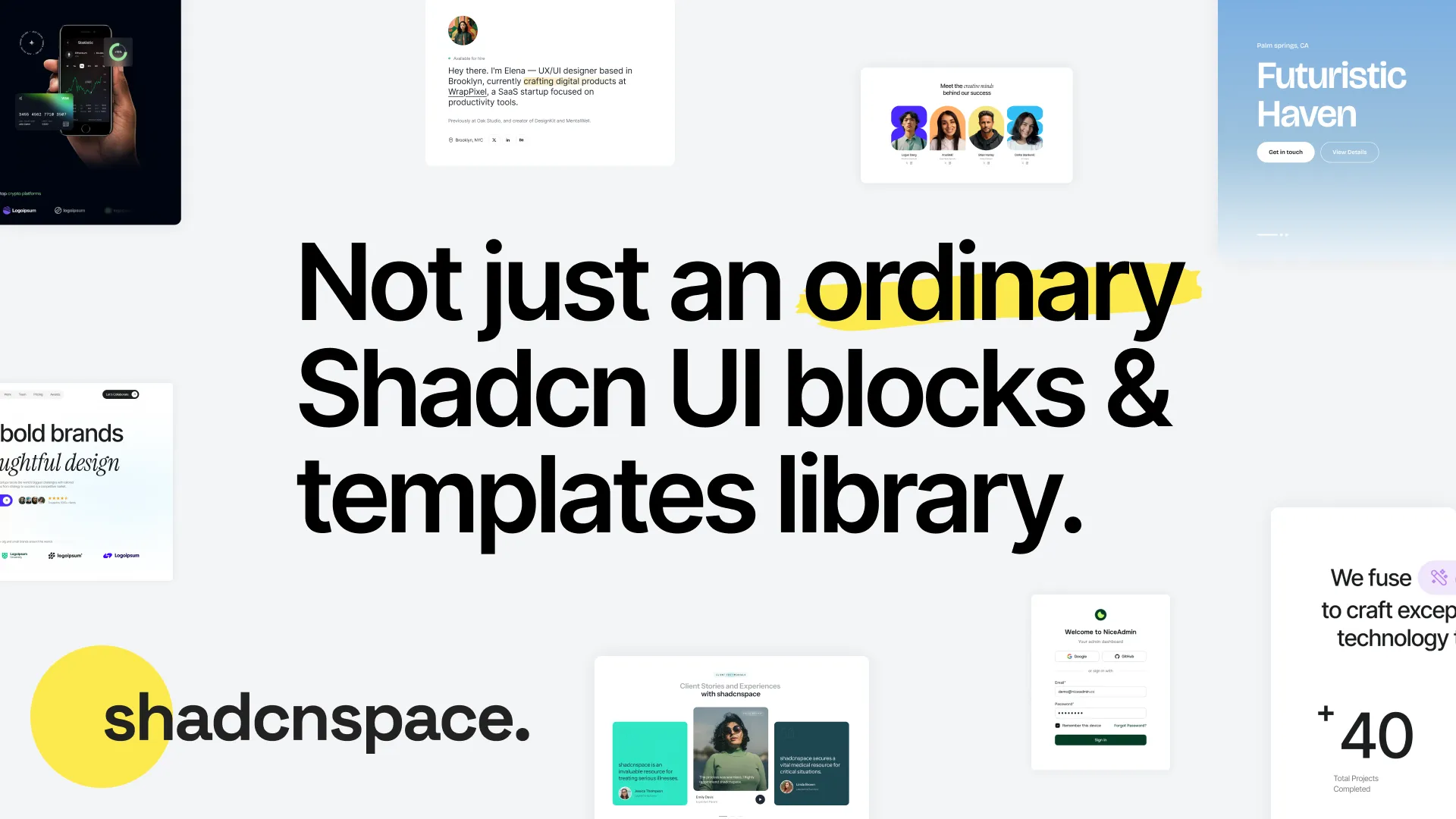
Spotlight: Shadcn Space
If you’re working with Shadcn UI, this Shadcn library is one of the newer libraries worth checking out. It helps developers move faster while building interfaces that look professional and feel premium.
What stands out is that it’s an open-source collection of production-ready Shadcn resources for React and Next.js projects. Built with Tailwind CSS on top of BaseUI primitives, it provides a predictable structure, reusable UI blocks, and full code ownership, something many developers care about.
You Get:
- 180+ Modern Shadcn Blocks
- 8+ Shadcn Templates
- 130+ Premium Shadcn Components
You improve the overall quality of your product from day one with Shadcn Space. You can install it via CLI, explore and generate components directly inside your IDE using its MCP server, and even add optional Framer Motion animations. It includes marketing sections, dashboard blocks, and a Shadcn Figma Kit to make the design workflow smoother.
1. Origin UI
This one is super clean. It’s a full-on component library built using ShadCN and Tailwind CSS, and it’s great for dashboards, forms, calendars—basically anything you’d want in an admin panel or internal tool.
You get:
-
Multiple layout variations
-
Prebuilt auth, onboarding, navbars
-
Full responsiveness out of the box
-
And everything is themeable and accessible
It’s like ShadCN, but with everything already set up so you’re not starting from zero. Super useful for production work.
2. MVP Blocks
This one’s for people building landing pages and marketing sites.
It gives you:
-
Full hero sections
-
Pricing tables
-
Testimonials
-
Animated CTAs and more
The cool part? It uses Framer Motion, so everything has nice little animations baked in. It’s modular, well-organized, and ideal if you’re trying to build a SaaS homepage quickly without hiring a designer.
3. SHSF UI
This one’s a bit smaller, but super polished.
The guy behind it put a lot of effort into tiny details—micro-interactions, hover effects, and smooth transitions. If you’re building a product where polish matters—like a payment flow, onboarding, or something with fine UX—you’ll love this one.
Also built on ShadCN and Framer Motion. It doesn’t have 100s of components, but the ones it does have feel premium.
4. KIBO UI
This one’s more utility-focused. It has a bunch of really handy components:
-
Payment forms with credit card validation
-
Chat interface with typing indicators
-
Video players
-
Date pickers and tabs
All made with ShadCN and Tailwind CSS. The code is very readable, and you can pick out just the components you need.
If you’re building tools with more interactivity—think AI tools, video platforms, or internal messaging apps—this one’s worth checking out.
5. Skipper UI
This is probably the most creative one on the list.
Skipper UI leans into design with:
-
Cursor interactions
-
Slide-to-confirm buttons
-
Gradient overlays
-
Interactive image hovers
It’s kind of a playground, but done well. Not for everyone—but if you’re building a portfolio, creative agency site, or something that needs a little extra visual flair, this is a cool one to explore.
Bonus Tip: Use TweakCN to Theme It All
If you’re using ShadCN (or any of these libraries), check out TweakCN.
It lets you:
-
Customize the color palette
-
Export Tailwind tokens
-
Instantly re-theme your entire UI kit to match your brand
TweakCN + any of these libraries = massive time-saver.
Wrapping Up
ShadCN/UI is a great starting point—but these component libraries take it even further. You can literally drop them into a new project and have 80% of the UI already done.
To recap:
-
Origin UI – Best for dashboards and admin tools
-
MVP Blocks – Great for marketing pages and SaaS homepages
-
SHSF UI – Super polished with micro-interactions
-
KBIO UI – Feature-rich components for interactive apps
-
Skipper UI – Stylish, playful, and creative
You don’t need to reinvent the wheel every time. These tools help you move fast and still look great.
Let me know if you end up using any of them. Would love to see what you build.
News Feed
Get the Hottest Cybersecurity News Delivered to You!
Thank you!
You have successfully joined our subscriber list.